At a glance
The full story
They had six unique products and had already started thinking about how they might go market. They came to us with a simple ask: what do you think of these names we’re knocking around?
We were inspired by the mission and in love with the product, but suspected their list wasn’t quite capitalising on the opportunity they had to really spark a fruit revolution. We got to work straight away. We created a unique panel- based approach to giving feedback on their names, drawing expertise from across Yonder which included analysts, creatives, researchers, and strategists and – through their combined experience – were able to confirm that the names might fall flat on the over saturated snack pot shelves.

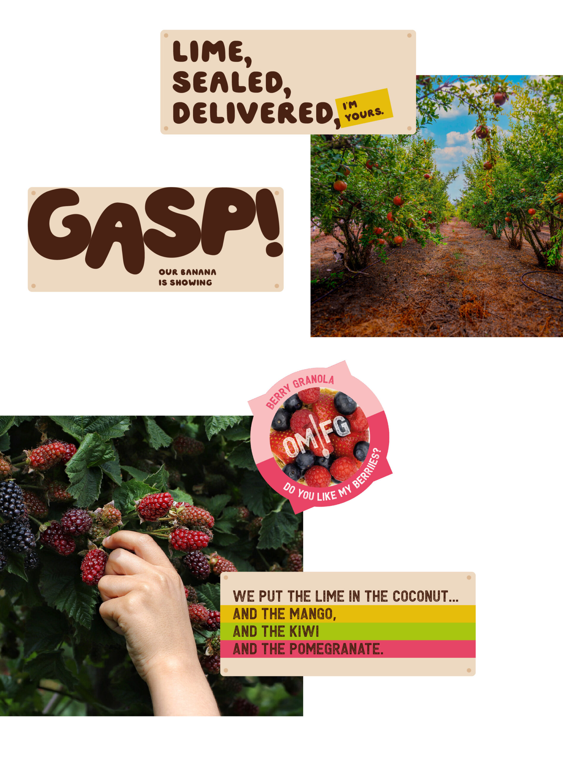
Unexpectedly fruity was the guiding light for a tone of voice that is packed with cheeky charm and is sometimes a bit…bananas. The new visual identity drew from the natural colours of fruit and was complemented by a series of stickers that makes it impossible to miss all the delicious benefits and good stuff that’s packed into each pot.
Our work culminated in the creation of an OMFG website as a place to showcase the brand, the products and the mission.


A juicy typeface


Great Taste
2022 (Tropical Bircher)
GREAT TASTE AWARDS 2022
Bronze Award, Innovation Challenge
LUNCH! AWARDS 2021
Client testimonial
The team at Yonder have been brilliant, working together we quickly experienced an OMFG moment. Their strategic expertise helped us land on a brand that truly reflects the mission and ethos of our products. There is no doubt that with the OMFG brand, having already picked up some innovation and quality awards, we will be able to deliver fruity goodness by the spoonful.
Ben Olins
Founder, OMFG
Chief Executive Officer, PrepWorld
Sector
FMCG
Geography
UK
What we did
Brand & Business Strategy
Customer understanding
Design